A white house with black trim can look crisp, timeless, and architectural when the contrast is handled well. The black details frame windows, doors, rooflines, and porch elements so the exterior feels sharper and more intentional.
The challenge is balance. Too much black can make the facade feel heavy. Too little can look unfinished. The right result depends on the home’s architecture, roof color, window style, front door, exterior materials, and surrounding landscape.
Strong high-contrast exteriors come from small decisions working together: where the black trim goes, how bright the white paint feels, which materials soften the contrast, and whether the final look suits the house rather than just the trend.
Why a White House With Black Trim Works So Well for Curb Appeal
A white house with black trim should be framed as a curb-appeal upgrade, not a guaranteed ROI project. The look can make a home feel sharper, cleaner, and more current, especially in listing photos where buyers often make quick first impressions from a small screen.
The stronger ROI evidence sits around exterior improvements more broadly. The 2025 Cost vs. Value report from Zonda shows that exterior projects continue to rank strongly for resale value, including updates such as garage doors, entry doors, siding, and stone veneer.
Paint and trim are not measured as a separate project in that report, so it is safer to describe black trim as a high-impact visual update rather than one of the highest-ROI upgrades on its own.
Black trim works because it gives a white exterior more definition. It frames windows, doors, rooflines, gutters, railings, and porch details so the architecture reads more clearly. Without contrast, those details can blur together. With the right balance, even a simple ranch, cottage, or bungalow can look more intentional and well maintained.
There is also some color-specific support for black accents. Zillow has reported that black front doors were associated with higher resale value in its paint-color research. That does not prove every black-trim exterior will increase resale value, but it does support the broader point that exterior color choices can influence buyer perception.
This is where presentation matters. Strong real estate photo editing can help exterior colors look clean and accurate without making the home look unrealistic. Tools connected to ai in real estate can also help agents or sellers preview exterior color ideas before committing to a full repaint.
Restraint Is What Separates Timeless From Trendy
The best black-and-white exteriors usually use black with intention. Window frames, shutters, gutters, railings, light fixtures, and the front door are common places to add contrast.
Too much black can make the house feel heavy or trend-driven, especially if the white paint is too stark or the roof color clashes with the palette. The goal is not maximum contrast everywhere. It is a balanced exterior where the black trim supports the architecture instead of overpowering it.
Why “Just Pick a White and a Black” Falls Short
A white house with black trim looks simple, but the paint choices still need to work with the actual home. The wrong white can look too stark in full sun. The wrong black can feel flat, harsh, or disconnected from the roof, windows, and exterior materials.
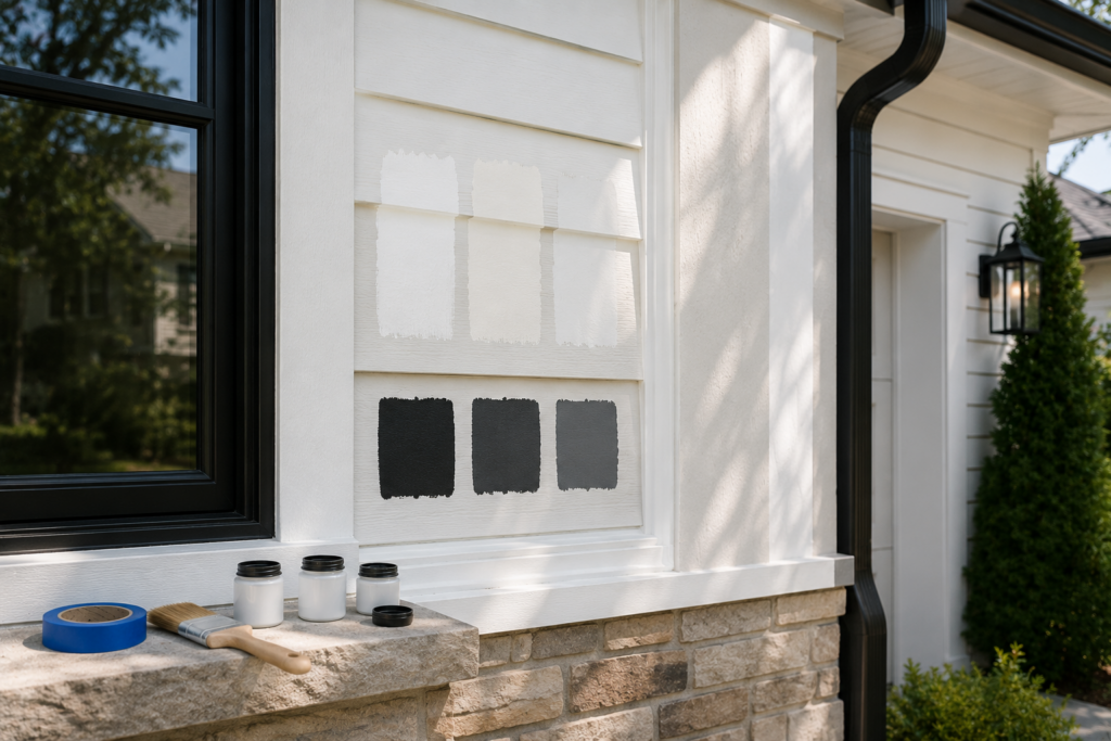
Light Reflectance Value, or LRV, is one reason this matters. A very bright white reflects more light and can look sharper outdoors than it does on a small paint card. Even popular whites vary: Benjamin Moore lists White Dove OC-17 with an LRV of 83.16, which makes it bright but softer than many crisper whites.
Material compatibility matters too. Vinyl siding needs extra care because darker paint can absorb heat and may lead to warping when the wrong product is used. Sherwin-Williams notes that vinyl siding can warp when it is repainted with a darker color than the original, and its VinylSafe colors are formulated to resist warping or buckling on sound, stable vinyl siding.
There is also a design risk. A high-contrast exterior can look timeless when the black is used with restraint. But if the white is too bright, the black is too heavy, or the placement feels formulaic, the result can start to look more like a quick flip than a thoughtful exterior update.
That is why testing matters. Paint samples should be viewed on the actual exterior surface, in sun and shade, and at different times of day before committing. The same caution applies to ai visual marketing for real estate: digital previews can help narrow the direction, but the final choice still needs to work on the real house, with its real materials, roof color, light, and landscaping.
Understanding LRV: How to Choose a White That Works With Sun Exposure
A white that looks soft on a paint chip can look much brighter once it covers an exterior wall. That is why homeowners should look beyond the color name and check the Light Reflectance Value, or LRV.
LRV measures how much visible light a paint color reflects. The higher the number, the more light the color bounces back. On an exterior, that matters because sunlight can make bright whites look sharper, flatter, or more intense than expected.
For homes with strong south- or west-facing exposure, a slightly softer white can be easier to live with than a very bright, crisp white. North-facing or shaded homes may be able to handle a brighter white because they receive less direct light.
Benjamin Moore White Dove as a Benchmark
Benjamin Moore White Dove OC-17 is a useful benchmark because it is bright but not icy. Benjamin Moore lists it with an LRV of 83.16, which keeps it in the bright-white range while giving it a softer look than many sharper whites.
That softness can work well with black trim because the contrast still feels clean, but not overly harsh. Warmer whites, such as Sherwin-Williams Alabaster, can feel creamier, while cleaner whites such as Sherwin-Williams Pure White can read more neutral depending on the light and surrounding materials.
The safest process is simple: check the LRV first, then test the undertone on the actual exterior. Paint a sample near the trim, roofline, stone, brick, or siding, and review it in morning light, afternoon sun, and shade before choosing.
Best Black and Charcoal Trim Colors: Why Muted Often Works Better
Pure black trim can look sharp on a paint chip, but it may feel harsh on a full exterior, especially against bright white siding in direct sun. The contrast can become too stark instead of refined.
Muted charcoal-blacks often work better because they still define the architecture without creating such a hard edge. They give windows, doors, gutters, and rooflines enough contrast while keeping the exterior softer and more balanced.
Why Sherwin-Williams Iron Ore Is a Strong Trim Option
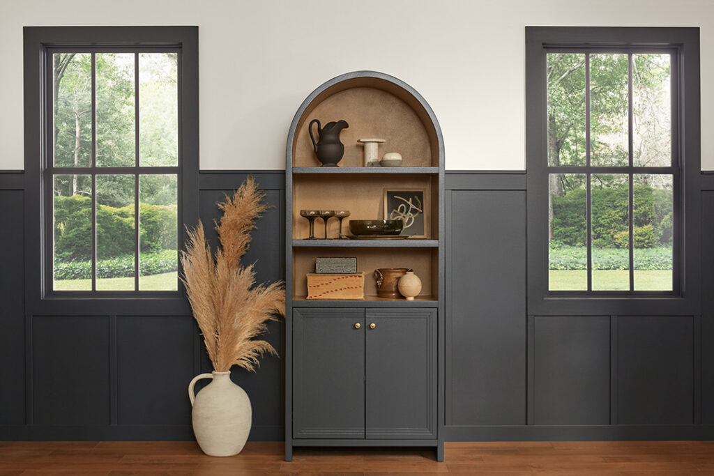
Sherwin-Williams Iron Ore is a popular choice because it reads as a deep charcoal rather than a flat true black. Against white siding, it creates strong contrast without feeling as severe as pure black.
That slight softness makes it especially useful on modern farmhouse, board-and-batten, cottage, and transitional exteriors. It can make the trim feel architectural and intentional rather than overly trendy.
Dark Trim Needs Better Paint Quality
Dark exterior paint can fade, chalk, or show wear faster than lighter colors, especially in strong sun. That does not mean black trim should be avoided. It means the paint product and finish matter.
Choose an exterior-rated paint designed for sun exposure, weather, and the surface material. This is especially important for trim, doors, railings, and shutters that get direct light or regular touch.
Apply Black Trim Sparingly
Black trim works best when it has a clear job. Window frames, front doors, gutters, railings, and light fixtures are common places to use it well.
Using black on too many exterior elements can make the design feel heavy or trend-driven. Before committing, view the palette from the street and at different times of day. The black should support the architecture, not dominate it.
Matte vs. Satin Finish for Black Trim
Finish changes how dark trim reads from a distance. A matte finish absorbs more light and can make charcoal trim feel softer. A satin finish reflects slightly more light and creates a sharper edge against white siding.
Matte can hide surface imperfections better, but it may be harder to clean. Satin is usually more practical for high-touch areas such as doors, door frames, railings, and shutters. For most homes, satin or low-sheen exterior trim paint gives a good balance of durability and polish.
Material Compatibility: What Vinyl Siding Owners Should Know Before Painting Trim Dark
A white house with black trim can work on many exterior materials, but vinyl siding needs extra caution. Dark paint absorbs more heat than light paint, and vinyl can warp or buckle when the wrong dark color or product is used.
That does not mean dark trim is impossible on vinyl. It means homeowners should confirm the siding material, condition, and paint compatibility before choosing a charcoal or black trim color. Sherwin-Williams VinylSafe colors are designed to give homeowners darker color options that resist warping or buckling on sound, stable vinyl siding.
If the trim, shutters, or accent pieces are vinyl, do not assume any black exterior paint will work. Use a product and color approved for vinyl surfaces, and confirm the recommendation with the paint manufacturer or a qualified painter before applying it.
This step matters most when the existing vinyl is light and the new color is much darker. A high-contrast palette can still be beautiful, but the material has to support the design. For vinyl homes, color safety should come before trend, contrast, or curb appeal.
Design Tips for Single-Story and Ranch Homes
Single-story and ranch homes can look wider and lower because of their long rooflines. A white exterior with black trim can work well on these homes, but the placement of the black accents matters.
Vertical siding, such as board-and-batten, can help create a stronger sense of height. The vertical lines draw the eye upward, which can make a low-profile exterior feel more balanced. Black window frames, gutters, railings, or a front door can then add definition without making the facade feel too heavy.
Use Black Trim With Restraint
For ranch homes, black trim usually works best when it is used in smaller, intentional areas. Window frames, front doors, porch railings, light fixtures, and gutters are safer choices than covering every fascia, gable, or trim line in black.
Too much black can make a low-roofline home feel heavier. The goal is to sharpen the architecture, not outline every edge.
Roof Color and Landscaping Matter
The roof should help connect the white siding and black trim. Charcoal, soft black, or warm gray shingles often work well, but the exact choice depends on the undertone of the white paint and the surrounding materials.
Landscaping also softens the contrast. Layered greenery, shrubs near the foundation, planters, and small trees can make a black-and-white ranch feel more welcoming. Without that natural texture, the palette may feel too stark.
For listing visuals or virtual staging,include mature plantings, clean walkways, and a clear front entry in the composition. These elements make the exterior feel livable and balanced rather than flat or overly graphic.
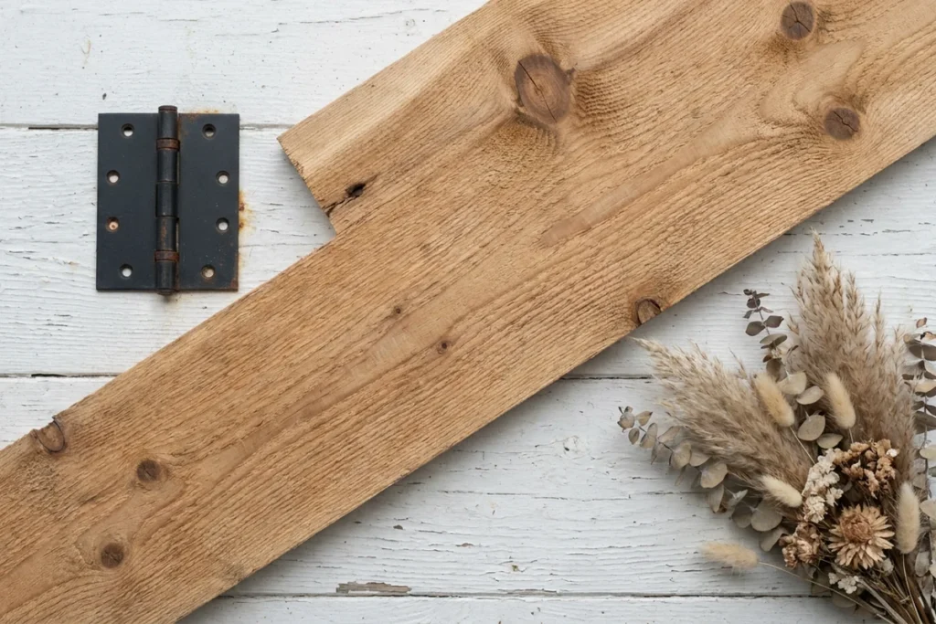
Adding Natural Wood Accents to Soften the Contrast
A white house with black trim can look crisp and architectural, but it can also feel stark if the palette is too limited. Natural wood helps soften that contrast without weakening the clean black-and-white look.
Wood adds warmth, texture, and a more lived-in feel. A wood front door, cedar soffits, timber porch beams, or wood-look garage panels can make the exterior feel more intentional and less like a quick cosmetic update.
Choosing the Right Wood Tone
The right wood tone depends on the white paint. Warmer whites, such as Benjamin Moore White Dove, usually pair well with honey, oak, cedar, or medium-amber wood tones. These finishes add warmth without clashing with the soft undertone of the paint.
Cooler gray-toned woods can work on some modern homes, but they may feel disconnected next to warm white siding. The safest approach is to test wood samples near the siding, trim, roof, and stone or brick before committing.
For the strongest visual impact, start with the front door. Porch columns, timber beams, garage door panels, and soffits can also work well when the architecture supports them.
Maintenance and Material Choice
Natural wood needs maintenance. Exterior wood should be sealed or stained to protect it from sun, moisture, and weathering. Without care, it can fade, gray, crack, or lose the warm finish that made it attractive in the first place.
Composite or wood-look materials can be a practical alternative in wet climates, high-sun areas, or lower-maintenance projects. The goal is the same: add warmth and texture so the white-and-black exterior feels balanced, not severe.
Step-by-Step Execution Guide: From Paint Selection to Final Application
A white house with black trim works best when the choices are tested before the full repaint begins. Paint color, siding material, sun exposure, roof color, and accent placement all affect the final result.
Step 1: Identify the Exterior Material
Start by confirming the siding and trim material. Wood, fiber cement, brick, stucco, and vinyl all respond differently to paint.
Vinyl needs the most caution. Dark colors can absorb more heat, so homeowners should use vinyl-safe paint colors and confirm compatibility before applying charcoal or black trim.
Step 2: Check Sun Exposure
Look at how the house receives light during the day. South- and west-facing exteriors often get stronger direct sun, which can make bright whites look sharper or more intense.
Shaded or north-facing homes may handle a brighter white more easily. The goal is to choose a white that looks clean outside, not glaring.
Step 3: Choose the White Body Color
Select the white paint after checking both LRV and undertone. Bright whites can feel crisp, but they may look harsh in strong sunlight. Softer whites can feel warmer and more natural, especially on older homes, cottages, farmhouses, and ranch-style exteriors.
Popular options such as Benjamin Moore White Dove, Sherwin-Williams Alabaster, and Sherwin-Williams Pure White can all work, but they read differently depending on the roof, landscaping, stone, brick, and light.
Step 4: Choose the Black or Charcoal Trim
For the trim, consider a muted black or charcoal instead of pure black. A color like Sherwin-Williams Iron Ore can give strong contrast while feeling softer than a flat true black.
If the trim or siding is vinyl, confirm that the selected dark color is approved for vinyl surfaces before buying paint.
Step 5: Test Samples on the Real Exterior
Paint samples directly on the exterior surface, not just on paper or cardboard. Review them in morning light, afternoon sun, shade, and cloudy conditions.
This step matters because exterior colors shift dramatically. A white that looks soft in one light can look too bright in another. A black that looks elegant on a small sample can feel too heavy once applied across multiple trim areas.
Step 6: Plan Wood Accents Before Painting
Decide early whether the exterior will include natural wood. A wood front door, cedar soffits, porch beams, or wood-look garage panels can soften the contrast and make the black-and-white palette feel warmer.
Planning these accents before painting helps avoid awkward transitions or repainting later.
Step 7: Apply Black Trim With Restraint
Start with the most natural trim placements: window frames, gutters, railings, light fixtures, and the front door. Then evaluate the full exterior before adding black to gables, fascia, or secondary details.
The goal is balance. Black trim should define the architecture, not outline every edge of the house.
Step 8: Use Exterior-Rated Paint for Dark Surfaces
Dark trim needs a durable exterior paint made for sun, weather, and the specific surface material. Charcoal and black paints can show fading, chalking, or wear more quickly when the wrong product is used.
A high-quality exterior formulation helps the finish last longer and keeps the contrast looking intentional instead of tired.
How to Verify Success: What a Well-Executed White-and-Black Exterior Looks Like
A white house with black trim should look balanced in more than one photo. The real test is how the exterior reads in direct sun, shade, cloudy light, and from the street.
Check the White in Direct Light
In strong afternoon sun, the white should still feel clean and comfortable, not glaring. A softer white often works better than a very bright white on homes with heavy sun exposure.
LRV can help guide the choice, but it should not be the only test. The white also needs to work with the roof, landscaping, stone, brick, and natural light around the house.
Check the Trim in Low Light
On an overcast day or in shade, the trim should still have enough depth to define the architecture. A muted charcoal can be a good choice because it keeps contrast without feeling as harsh as pure black.
If the trim looks flat, muddy, or disconnected from the rest of the exterior, the color may need adjustment.
Step Back and Check the Balance
View the home from the street before making final decisions. No single element should dominate the eye. The siding, trim, front door, roof, and any wood accents should feel connected.
The goal is a composed exterior, not the highest possible contrast. Black trim should frame the architecture and guide the eye, not overpower the facade.
Test It in Listing Photos
Listing photos are a practical final check. A well-executed black-and-white exterior should photograph with clear lines, balanced contrast, and strong curb appeal.
This matters because strong visual storytelling for realtors depends on exterior images that communicate structure, style, and condition quickly. If the photo looks too flat, too harsh, or too trend-driven, the palette may need softer contrast, better lighting, or more natural elements around the home.
Final Thought
A white house with black trim can feel timeless when the contrast is handled with restraint. The strongest results usually come from softer whites, muted black or charcoal trim, and accent placement that supports the architecture instead of overpowering it.
Before painting, homeowners should test the full palette on the actual exterior. Sun exposure, roof color, siding material, landscaping, and natural wood accents can all change how the black-and-white combination reads from the street.
Vinyl siding needs extra caution because not every dark paint is safe for vinyl surfaces. Homeowners should confirm material compatibility and choose exterior-rated products before applying charcoal or black trim.
For sellers, the goal is simple: create curb appeal that looks clean, balanced, and intentional in person and in listing photos. Digital preview tools can help narrow the direction, but physical paint samples in real light should make the final decision.
FAQs
Can I use Sherwin-Williams Iron Ore on vinyl window frames?
Possibly, but confirm the exact product and VinylSafe color before painting. Vinyl can warp when painted with a darker color that absorbs too much heat, so use a vinyl-safe exterior product and check the manufacturer’s guidance for trim or window-frame applications.
Should a north-facing home use a higher-LRV white?
It can. North-facing or shaded homes often tolerate brighter whites better because they receive less direct sunlight. Still, test samples next to the roof, trim, siding, and landscaping before choosing.
Does black trim fade faster on wood than on fiber cement?
It can, depending on paint quality, prep, sun exposure, and surface condition. Wood is more porous and may need more maintenance, while fiber cement often holds exterior paint well when properly primed and painted. South- and west-facing trim usually needs the most attention.
Can I keep my existing white siding and repaint only the trim black?
Yes, but test the trim color against the existing white first. If the siding has a strong yellow, pink, gray, or blue undertone, some black or charcoal shades may feel disconnected. A sample patch in natural light is the safest way to check the pairing.