Pantone: A Pioneering Color Power
For over two decades now, Pantone has been the most influential trendsetter in color forecasting and the color palettes of design and fabrics. It has a well-known color matching system – the Pantone Matching System (PMS) – and a team of experts who are solely concerned with color trends in fashion, design, and branding.
Each year as December arrives, Pantone announces the color of the upcoming year, and for 2024, they have chosen “Peach Fuzz” as the new queen of colors. A shade that, as Leatrice Eiseman (executive director of Pantone) put it, “echoes our innate yearning for closeness and connection.”
We seized this opportunity to take a look at Pantone’s colors of the year from 2014 to 2024 to see how those choices have been received by the affected industries. Let’s dive in.
2014: Radiant Orchid
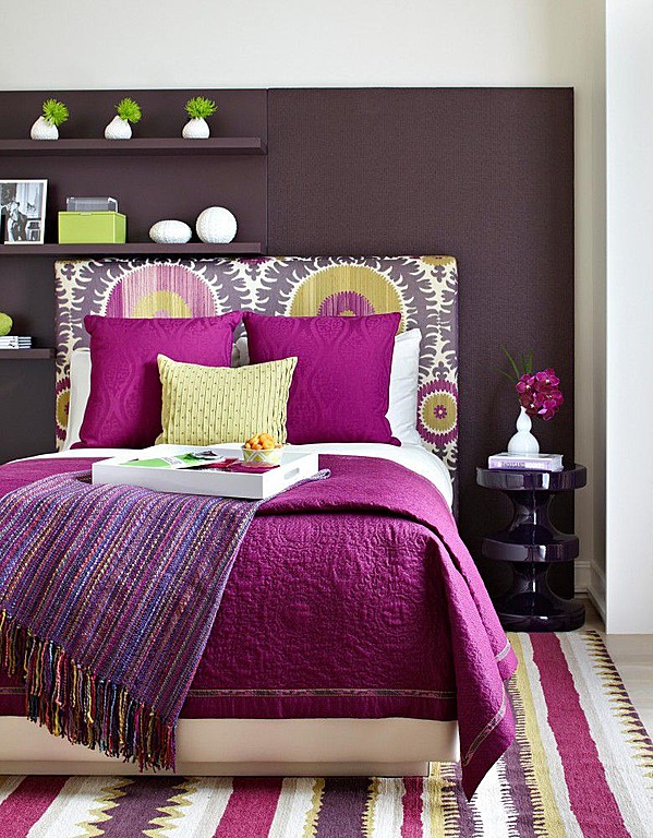
When Pantone selected Radiant Orchid as the color of 2014, some were skeptical about its appeal while the majority liked its uniqueness and versatility. Women especially loved it as it created a healthy glow on their skin. Eiseman believed it inspired joy, love, confidence, and health. She saw it as “an expressive, exotic purple that sparked imagination and creativity.” In interior design, Radiant Orchid was highly welcomed, too. This captivating shade was celebrated for its adaptability and ability to energize spaces. It paired well with neutral color palettes and soon became a good choice for accent pieces and accessories.
2015: Marsala
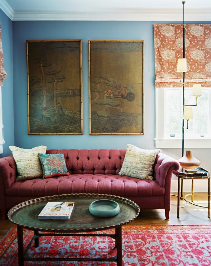
You probably remember this color from lipsticks. Designers adored its grounding effect and often used it in textiles and fabrics. Its rich red-wine hue also added a sophisticated and down-to-earth touch to interior design. Couches, kitchen furniture, and even walls in Marsala are still common. Fashion aficionados also took a liking to it. Within months, Marsala won every heart! The luxurious depth it carried was unprecedented, and it suited any person at any age.
2016: Rose Quartz’s vs. Serenity
The following year, Pantone couldn’t decide between two colors. The pale pink Rose Quartz seemed inseparable from an even paler blue that came to be called Serenity. The combination makes a soothing and harmonious palette that one wants to carry around all the time.
In fashion, these soft hues easily made their way onto runways, clothing, accessories, and even makeup palettes. Their gentle and tranquil tones helped with creating feminine and romantic looks, while also adding a touch of sophistication and elegance to any ensemble. In interior design, Rose Quartz and Serenity found their place in creating highly relaxing spaces. Whether used as accent colors or as the main palette, Rose Quartz and Serenity have remained favorite choices for those seeking to create a calming and stylish atmosphere in both fashion and interior design.
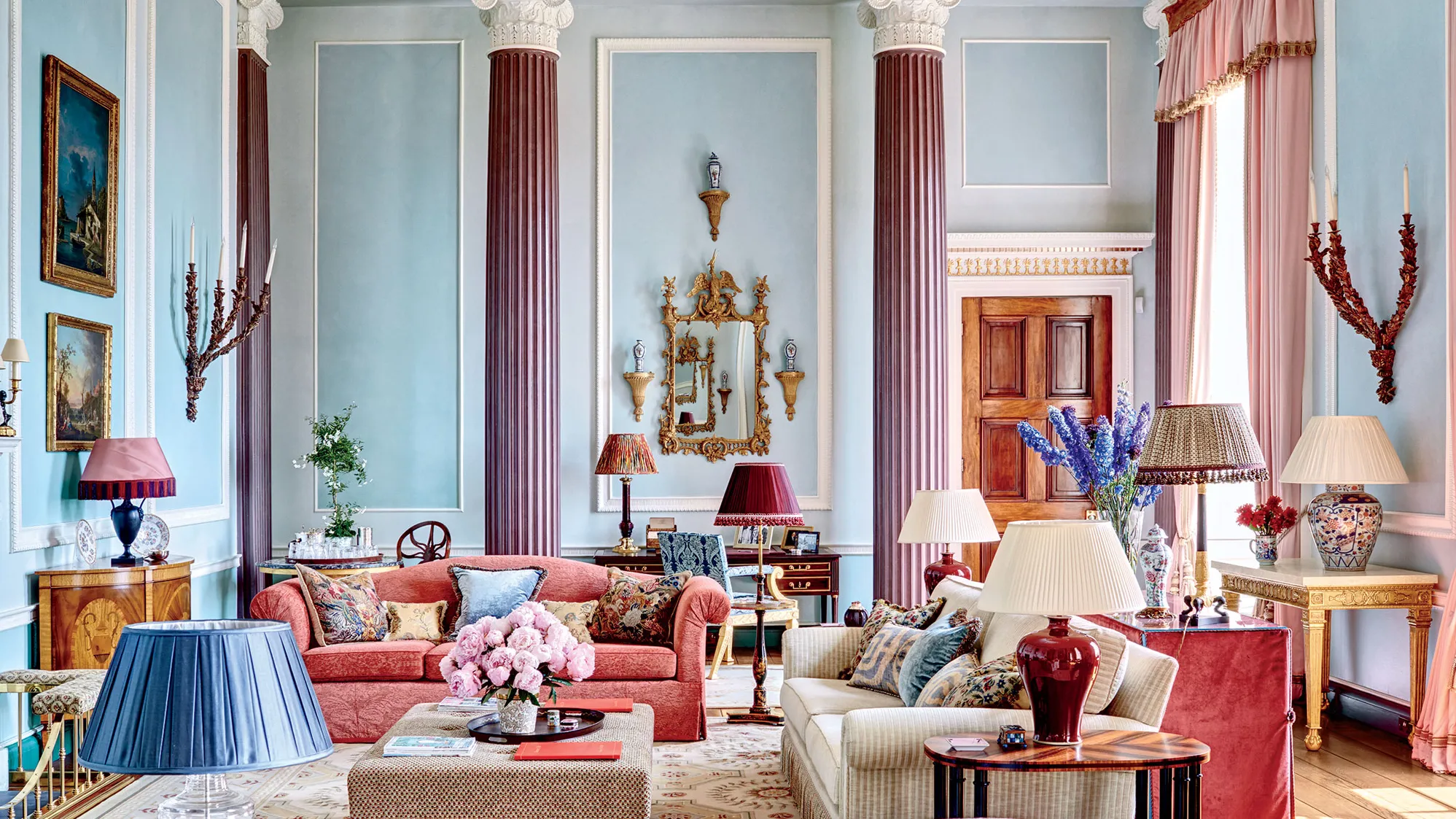
2017: Greenery
During the days of uncertainty and various environmental issues in 2017, Greenery aimed to inspire individuals to take an optimistic outlook toward life and respect nature more than before. Greenery encouraged fashion designers to use vibrant green tones in their collections, and it was well-received. This color became exceptionally popular in the spring and summer of that year.
As for its use in interior design, Greenery was incorporated as an accent color in items such as throw pillows and artwork, while indoor plants became highly sought after for adding a natural feel. Natural materials like wood and bamboo were also revived, and botanical patterns decorated walls and fabrics.
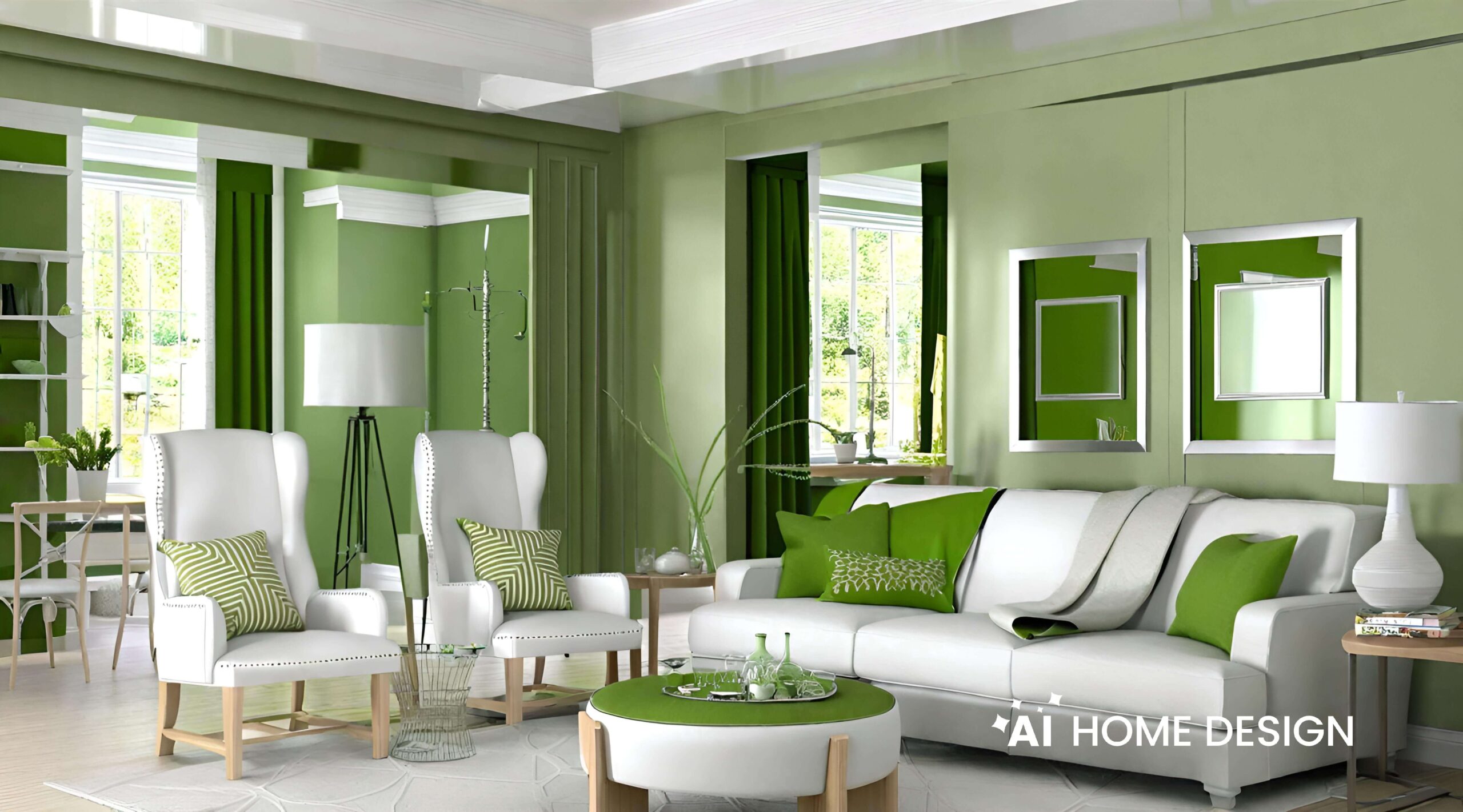
2018: Ultra Violet
A shade filled with mysticism and spiritual value; that’s what Ultra Violet became famous for. Purple hues are often connected with mindfulness and provide a refuge from today’s over-stimulated world. Ultra Violet was praised for its potential in interior design, with its rich history and associations with royalty, the suffragettes, and countercultures. It was viewed as a powerful shade reminding us of the mysteries of the world and discoveries that push the boundaries of knowledge.
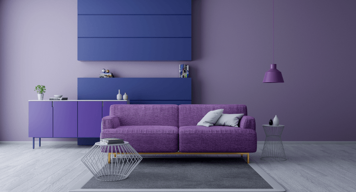
2019: Living Coral
In a way, Living Coral symbolizes our innate yearning for optimism and happy pursuits in life, embodying our desire for playful expressions. It reflects our awareness of the natural beauty around us as well. Like always, designers received the selected color with joy and admiration. It was repeatedly recommended for use in accents to bring pops of color into more neutral spaces. Fashion designers also welcomed the idea and described it as soothing and vibrant.
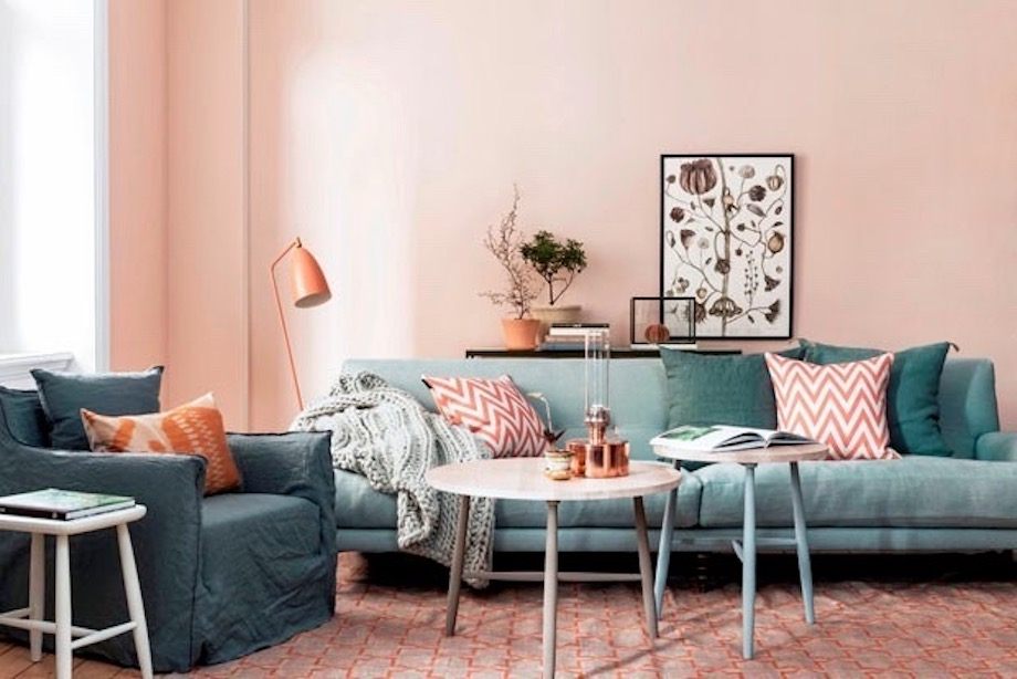
2020: Classic Blue
The beginning of a new decade was high time for blue hues to reappear, and what better candidate than Classic blue? Classic Blue was admired for creating a feel of tranquility and simplicity that made it a popular choice in fashion and interior design. Interior designers found interesting ways to incorporate this color into our homes. From furniture and accent walls to kitchen cabinetry, things turned blue in 2020.
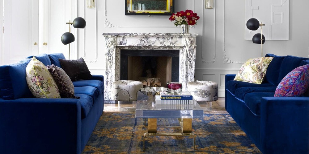
2021: Ultimate Gray and Illuminating
For the second time in its own history, Pantone decided to nominate two winners! And this time, Ultimate Gray was one of the two winners. Gray combinations can stand on their own and make the entire design of a house; yet, they go perfectly well with a whole lot of other colors, including Illuminating from the family of yellow.
But this was perhaps the first time interior designers were more excited than fashion designers about Pantone’s choice of colors. Ultimate Gray and Illuminating seemed to be of greater appeal in design than in fashion.
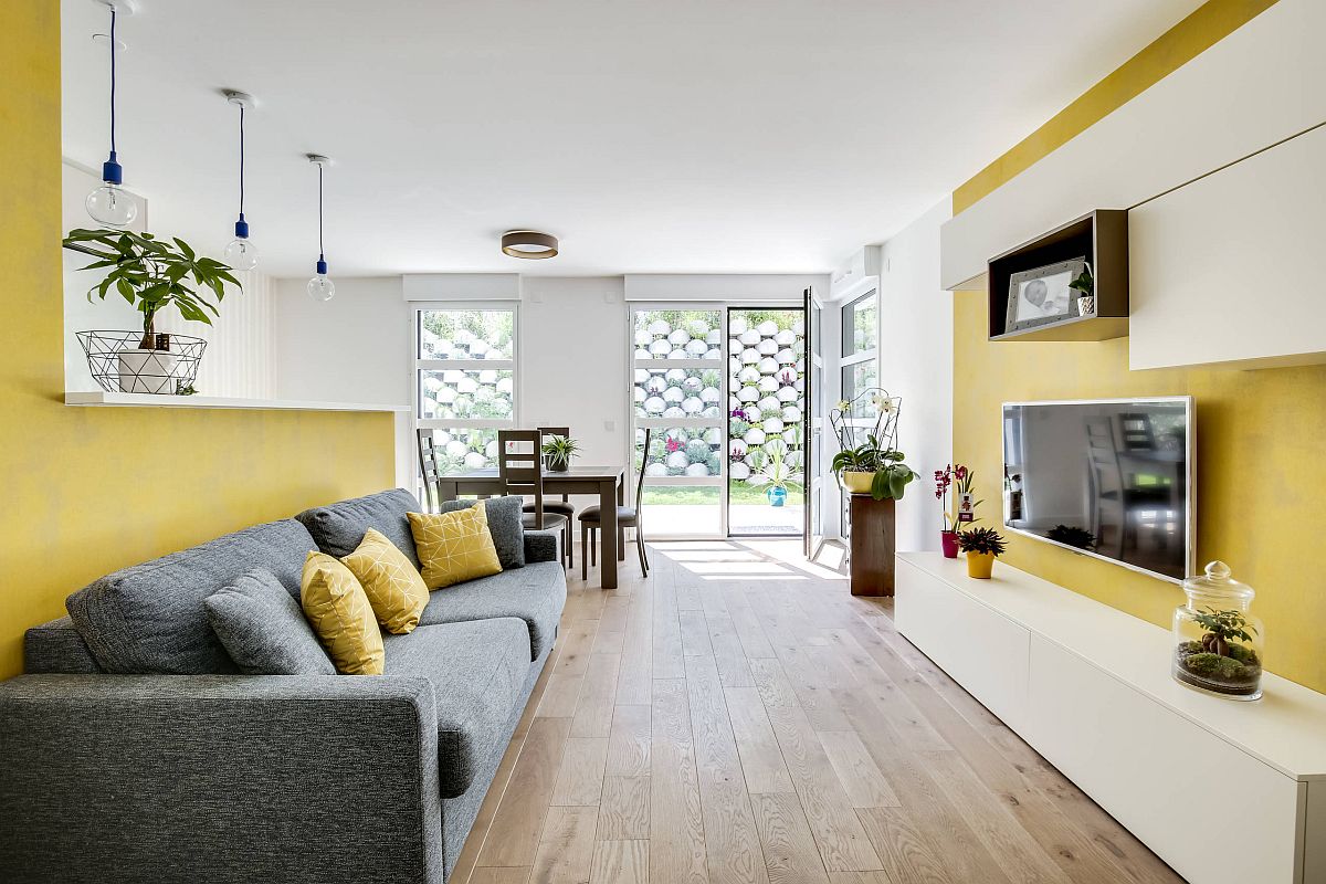
2022: Very Peri
Encouraging creativity, Very Peri gives us every reason to challenge the norms and think outside the box. That’s why everyone set out for innovation in the fashion and design sectors in 2022.
The color’s versatility was highlighted as it allowed for creative applications across various industries. Designers saw Very Peri as a unique color that could pair nicely with others, adding a soothing yet vibrant touch to design elements. If you take a look at common designs in that year, you can still see those purple-like cabinets and more than a few dark purple walls.
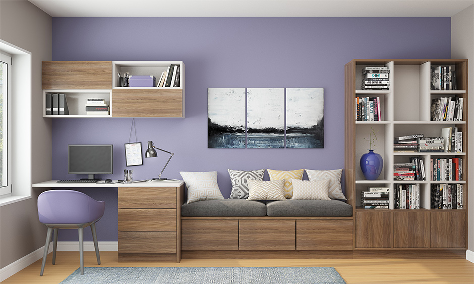
2023: Viva Magenta
Some eight years passed and no sign of the red family! That’s why 2023 rightly belonged to them. The pinkish-purple hot color called Viva Magenta suggests joy, optimism, and courage. As usual, designers in all sectors liked the choice and tried to align their designs with this color. Interior designers suggested Viva Magenta for bedrooms, especially as it evoked a sense of safety and stillness.
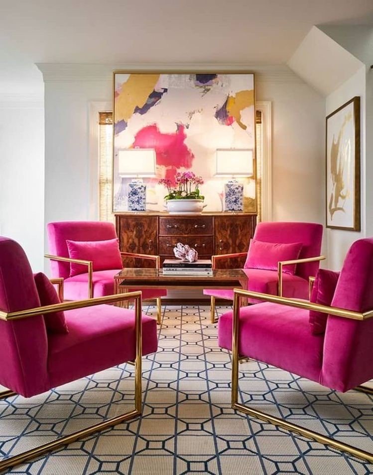
2024: Peach Fuzz
And all that brings us to the year ahead! What about the 2024 Pantone Color of the Year? Well, it’s too soon to tell, but looking at the past, it’s safe to say that everybody will love it.
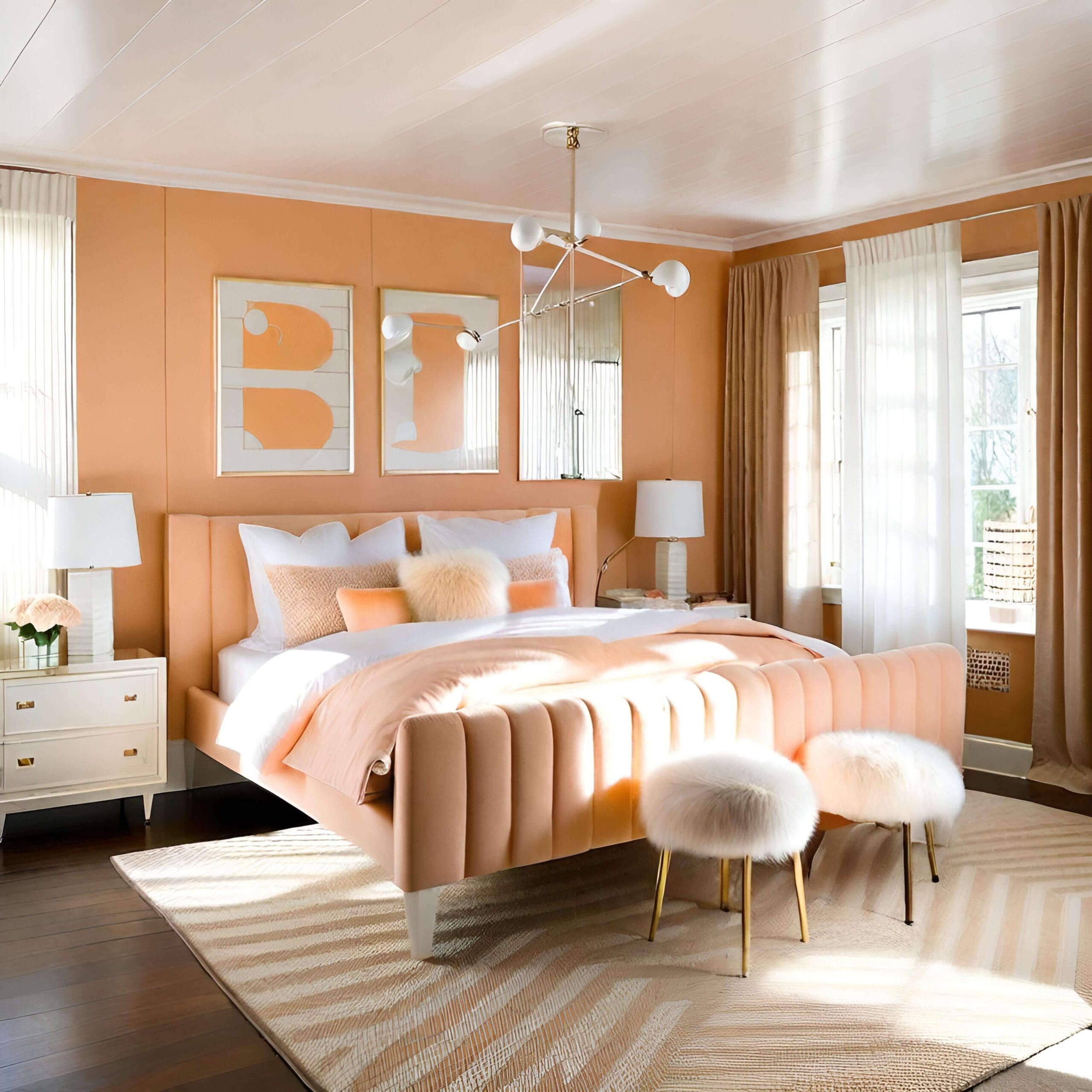
I don’t know about fashion designers, but I can assure you that in interior design, Peach Fuzz is definitely a nice choice. Combined with white, this color creates an amazingly calming atmosphere in the house.
Want to see for yourself? Check out the Peach Fuzz color palette on AI HomeDesign. Just remember that you must first upload a photo so that you can see the color palette. Happy designing!
Peach Fuzz on the Horizon
The journey through these colors reflects an evolving palette that goes beyond mere aesthetics. It’s about resonating with the times and evoking emotions that range from tranquility and joy to resilience and innovation.
As we embrace Peach Fuzz in 2024, it’s clear that Pantone’s choices continue to be more than just about a color choice – they’re a reflection of our collective human experience. The anticipation for how Peach Fuzz will be received and interpreted in various creative fields is high, especially in interior design, where its calming presence is already predicted to create soothing atmospheres.
The full potential of Peach Fuzz remains to be seen, but if Panton’s track record has taught us anything, this color will surely leave its mark on design and beyond.


