Real Estate Brochure: Step-by-Step + Print Specs
In short
- Pick the job first: decide if the reader is a seller hiring an agent or a buyer deciding to tour.
- Consistency beats volume: a small, matched photo set reads more professional than a crowded grid.
- Print specs prevent pain: export with bleed, safe margins, CMYK, and 300 DPI, then run QA before ordering.
A seller can forget a pitch, but a real estate brochure sits on the kitchen counter after the appointment. That is the moment a listing decision gets made. The piece needs to look intentional, not like a printout.
A brochure that wins listings sells the marketing plan first and the property second. It shows process, taste, and accuracy in one object. It also fits inside a wider real estate marketing plan that the seller can audit.
The workflow below runs in the same order most agents work, from format choice to pre-press checks.
Why a Printed Brochure Still Wins Listings in 2026
Print survives the appointment. A seller can set it down, come back later, and re-read it without opening a laptop. That physical presence matters when two or three agents compete for the same signature.
A brochure also signals follow-through. Sellers read design choices as proof of how the listing will look online, in ads, and in email. A clean grid, accurate specs, and consistent photos make the marketing plan feel real.
Transferability adds a second advantage. A seller can hand the brochure to a spouse, a parent, or a neighbor. A single PDF link can do that too, but print removes friction. No logins, no search, no dead text message.
NAR publishes ongoing housing research that helps teams understand how buyers and sellers shop and compare marketing materials. The Research and Statistics hub works as a starting point for market and consumer behavior context.
Brochures underperform when they act as a standalone lead source with no destination. They also fall flat when the photo set looks mixed, dim, or out of order. The fix is not more panels. The fix is one clear job, one CTA, and one consistent photo set.
Pick the Right Brochure Type Before Design Starts
A brochure format should match the reader’s decision. A buyer wants enough detail to tour. A seller wants proof the agent can market.
A brochure is also not a flyer. A flyer is usually a single sheet built for a quick skim or a sign box. A brochure asks for more attention and rewards it with structure. For single-page pieces, use the real estate flyer templates and design tips workflow instead.
Four scenarios cover most use. Each one needs a different layout and a different CTA. Picking the wrong one creates clutter fast.
| Scenario | Primary reader | Format | Best file to build | Primary CTA |
|---|---|---|---|---|
| Listing appointment leave-behind | seller | booklet or multi-page PDF | print PDF and matching digital PDF | book the next step meeting |
| Open house handout | buyer | trifold or bifold property brochure | print PDF with folds marked | schedule a private tour |
| Farming or direct mail | neighbor or future seller | short brochure or postcard-adjacent piece | print PDF with tight headline space | see recent local results |
| Online follow-up | buyer or seller | digital brochure or flipbook | shareable PDF | view tour and disclosures |
Quick match of brochure format to the reader’s decision moment.
Format choice also depends on timing. A seller-facing leave-behind should not get built the night before. An agent can still move quickly, but the order matters. The next section keeps rework out of the week.
Build the Brochure Without Rework
The fastest builds start with a single decision: seller-facing or buyer-facing. That choice controls the cover, the CTA, and the proof that belongs inside.
Agents should plan a seven-day window from outline to finished print, even when the file gets built in one evening. The buffer protects accuracy, proofing, and printer turnaround. It also leaves room for a physical proof.
A clean operational rule helps: send the final PDF proof to the seller two days before the appointment, not the morning of. That timing gives space for factual corrections without forcing design changes.
The process below avoids the common trap of designing first and fixing facts later.
Choose the brochure job and reader
Write one sentence that states the job. Example: “This is a seller leave-behind that proves the marketing plan.” Lock that sentence before any layout work starts.
Pick one CTA and one destination
Select a single destination page and build the brochure around it. Keep one backup path as plain text, like a short URL printed next to the QR.
Collect verified facts before writing
Pull the address, bed and bath count, square footage source, HOA facts, and key dates. Save sensitive details for the conversation, such as seller schedule, access notes, lockbox, and motivation.
Draft the page map on paper
Sketch panel or page titles first, then assign one idea to each panel. Reserve one panel for disclosures and required license lines so they do not get squeezed later.
Finalize photos and fix consistency
Choose a tight photo set and edit them to match white balance and brightness. Lock vertical lines, then export at print-ready resolution.
Design the layout and export for print
Place the hero image first, then the headline, then the specs. Export with bleed and safe margins intact, and keep fonts embedded.
Proof, QA, and order a physical test print
Run the QA checklist, then print one copy on an office printer. Order a single physical proof from the printer, and budget one extra day for it.
What to Include and Two Copy-Ready Outlines
Every brochure needs structure. A seller compares agents by clarity and accuracy, not by how many icons fit on a panel. A buyer skims for a reason to tour.
The same content rule works for both: one idea per panel, one CTA per piece. When two messages compete, the reader remembers neither.
Agents can also separate what belongs in the deliverable from what belongs in the conversation. A brochure should carry verified facts, the photo story, and the next step. It should not carry anything that creates risk or dates fast.
Commission or fee figures should stay out of the brochure. Sellers read those numbers emotionally, and a printed piece freezes the conversation before it starts. Fee structure belongs in the appointment and the agency disclosure process.
Use this contents checklist to keep the piece complete without overstuffing it:
For copy, start from the MLS narrative and tighten it for print. The listing description that matches the photos guide helps keep language consistent across channels.
Outline for a trifold property brochure
Panel planning starts with the fold. The cover should carry the hero exterior, the address, and a single headline. The inside panels should read like a walkthrough, not a collage.
A practical panel map: cover hero plus address, inside left lifestyle panel, inside center kitchen and living, inside right primary suite, back panel specs block plus agent and brokerage lines, and a final panel reserved for the CTA and disclosures. Keep the QR near the specs so it feels like the next step.
Outline for an eight-page listing booklet
A seller booklet should open with the seller’s address on the cover. That one detail signals preparation. Page two should explain what happens in week one. Page three can show the photo plan and a before and after spread.
Page four should carry pricing context and how the list price will get defended. Page five should list distribution channels across web, email, and local exposure. Page six should show recent results and proof points. Page seven can carry testimonials with written permission. Page eight should list next steps and signature lines.
Seller-facing versions often pair well with a full pre-listing package so the brochure sits inside a complete appointment leave-behind.
Photo Selection and Prep for a Consistent Set
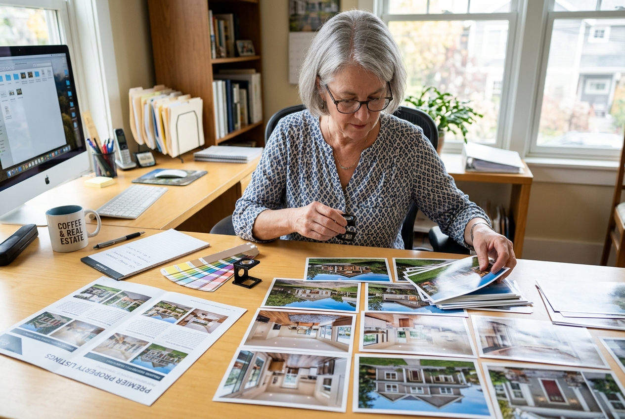
Brochure photos need to feel like one shoot. A set with mixed color, mixed exposure, and mixed angles reads amateur, even when each image looks fine alone.
Start with a small shot list built for print. One exterior hero, then kitchen, main gathering space, primary bedroom, primary bath, and one outdoor or lifestyle shot usually cover the story. Add one detail photo only when it proves a premium feature.
Hero selection matters more in print than online. A front-facing or three-quarter exterior works best. Keep cars out, straighten verticals, and pick the time of day where the home looks honest and bright.
Consistency comes from routine. Match white balance across the set. Bring exposure to the same baseline. Straighten vertical lines in every wide shot. The real estate photography fundamentals checklist helps teams keep framing and light predictable.
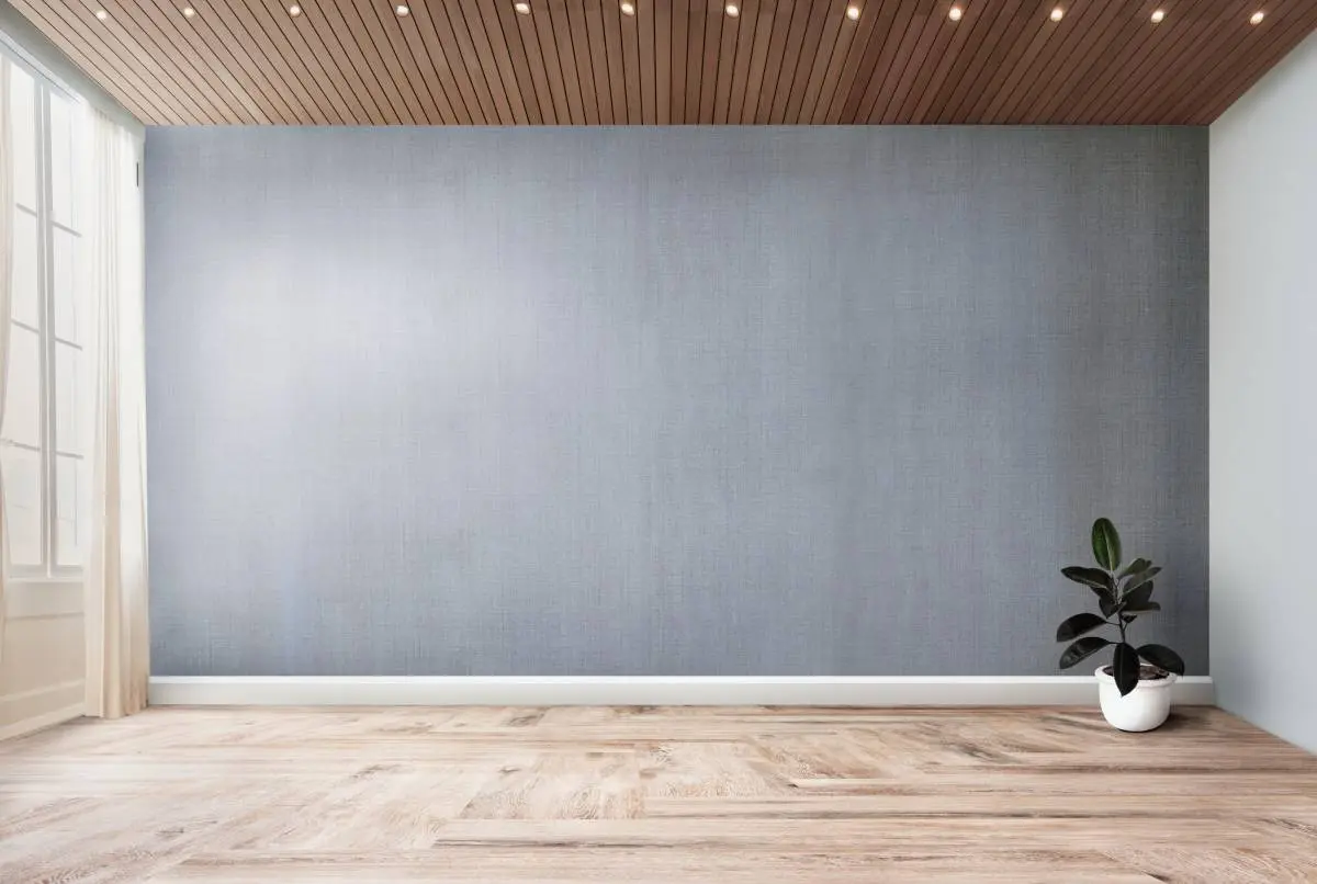
Two cases need extra prep before print. Empty rooms can look small and hard to read. Dated rooms can pull attention away from layout and light. Virtual staging and photo cleanup can solve both when the brochure includes clear disclosure.
One practical option is AI virtual staging, which can handle virtual staging, photo editing, and renovation previews in one place. AI HomeDesign includes 11 tools across three hubs, with seven renovation tools, one account and one credit pool, unlimited free regenerations, and pricing from $0.24 a photo. It is MLS-compliant by default.
Use plain disclosure captions that fit print. Two safe lines:
- “Virtually staged image. Furniture and decor added digitally.”
- “Image enhanced for brightness and color. No structural changes made.”
Stage your first listing in under 5 seconds
15 space types, 10 styles, MLS-compliant by default. All 11 tools on one account. Free trial credits, no credit card.
Start staging freeCopy and Layout That Reads Like a Brokerage Piece
Print copy needs to earn attention fast. A reader should understand the headline and the next action in one glance. The body text can then support the claim.
A simple structure works on every panel. Lead with a headline that makes one claim. Add a short body block, then prove it with one specific detail. “South-facing windows” becomes “light stays bright through dinner.” “New HVAC” becomes the year and the warranty detail.
Clichés cost trust. Words like “charming,” “must-see,” “cozy,” and “unique” read like filler. Sellers notice them, and buyers ignore them. Concrete facts age better than adjectives.
Layout makes the content feel expensive. One dominant image per spread or inside panel beats a grid of tiny photos. White space also signals professionalism. When every corner carries a box, the reader assumes the agent rushed.
Brand consistency should stay simple. Two fonts max, consistent logo placement, and a repeatable color palette keep the piece cohesive. Put required marks and license lines in the same place on every piece so they do not get missed.
Market tier changes the balance. Luxury brochures can lean into white space, fewer images, and heavier paper. Entry-level and rentals benefit from stronger specs blocks and faster-scan bullets. Mid-market pieces usually need both, with the photos doing most of the persuasion.
Real Estate Brochure Printing Specs That Avoid Reprints
Print quality comes from three choices: size, export settings, and how the file handles folds. A file that looks clean on screen can still print soft or off-center.
Start with standard sizes that most printers template well. A common trifold uses 8.5x11 with three panels that land around 3.67 inches each. The fold-in panel should be slightly narrower so the piece closes flat. Booklet-style pieces often start as 11x17 and fold to 8.5x11.
Bleed and safe margin decide whether text gets cut. Use 0.125 inch bleed on all sides. Keep text and logos inside a 0.25 inch safe margin. Avoid placing critical content across a fold line.
Photo resolution must match print. Plan for 300 DPI at final printed size and export in CMYK. A web-sized MLS image can look fine online yet fail on a full panel. The MLS photo specifications guide helps teams see the difference between web delivery and press-ready export.
Use this quick spec table as a pre-press reference:
Color mode
Standard target: CMYK export
Why it matters: reduces color shifts on press
Common miss: leaving files in RGB
Photo resolution
Standard target: 300 DPI at print size
Why it matters: keeps images sharp on large panels
Common miss: stretching a small image
Bleed
Standard target: 0.125 inch all sides
Why it matters: prevents white edges after trimming
Common miss: exporting without bleed
Safe margin
Standard target: 0.25 inch for text
Why it matters: protects copy near edges
Common miss: placing logos too close
Trifold folds
Standard target: inside fold panel slightly narrower
Why it matters: closes flat without buckling
Common miss: equal panels that bind
Proof
Standard target: order a physical proof
Why it matters: catches color and trim issues
Common miss: skipping proof to save a day
Common brochure print specs that prevent trimming and color surprises.
Paper and finish affect handling. Gloss can hide fingerprints at open houses, while matte or silk can fit a quieter luxury brand. The printer’s own template should control the final settings.
Compliance, Tracking, and Pre-Print QA
Pre-print QA checklist
Run this before you send files to the printer or approve the proof.
Compliance belongs in the layout, not as an afterthought. Fair housing rules require language that describes the property, not the buyer or neighborhood demographics. Equal housing marks and licensing lines should appear where local rules require them.
Sourcing protects credibility. School ratings, crime, and walkability claims need a named source and a date, or they should get cut. Print freezes statements, and a wrong claim is harder to correct than a web page.
Disclose virtually staged and enhanced images with a visible caption. Virtual staging should add only furniture and decor. Permanent features should stay unchanged. MLS and state advertising rules vary, so teams should confirm local requirements. The guide on what MLS rules allow in edited photos helps frame common boundaries.
Tracking works best with one CTA and one destination. Use one landing page that holds the tour, full photo set, floor plan, disclosures, and a scheduler. Print the QR at about 0.8 to 1 inch, keep a clear quiet zone, and use high contrast. Add a plain URL beside the code for anyone who will not scan.
Brochures also work better when they sit inside a larger channel plan. HousingWire’s list of real estate marketing ideas can help teams plan how print supports email, social, and local exposure.
Run this pre-print QA checklist in ten minutes:
A two-person review catches most errors. One person builds the file, and someone else reads it cold. Printing a single copy on an office printer also helps, since typos hide on screens.
Three situations also call for a format change. Distressed sales often need a softer seller booklet that avoids glossy promises. Off-market listings usually need a tighter, private packet with strict distribution control. Rural or agricultural properties may need more land and access context than interior photos can carry.
Real estate brochure templates: where to get one, and how to judge it
A template gallery shows you the thumbnail. It does not tell you whether the file will survive contact with a printer or a real listing, so check four things before you commit. First, bleed: open the export settings and confirm the document carries 0.125 in (3 mm) of bleed and crop marks. Browser tools often bury this in a "PDF Print" option, while downloadable print kits usually have it built in. Second, structure: repeated elements like the agent bar or the page numbers should sit on a master page or a locked layer, not be pasted onto every panel, or a phone-number change becomes a six-place edit. Third, color: printers want CMYK, and most browser editors work in RGB and convert on export, which shifts saturated blues and greens. Ask for a proof if the brand color matters. Fourth, image slots: count the photo frames and compare them with the shoot you actually have. A twelve-frame layout and seven photos means either filler or a rebuild.
Canva
Exports PDF Print with crop marks and bleed, plus PDF Standard, PNG and JPG. The biggest real-estate-specific library here, paginating past 150 designs - though you will be swapping out Pro-locked photos as you go.
Open Canva →Adobe Express
Typography defaults are cleaner than Canva's, but the real-estate brochure library is noticeably smaller.
Open Adobe Express →Marq (formerly Lucidpress)
Built around brand templates and locked fields, which Canva's free tier does not do well. The right pick when several agents produce on-brand brochures from one file.
Open Marq (formerly Lucidpress) →The Paper Mill Store
The only source here that publishes exact folded panel sizes for every fold - an 11x17 gate fold is 4.25x11 panels - so it doubles as a spec reference. Best when you already know your printer.
Open The Paper Mill Store →TheGoodocs
Twelve real-estate brochures, bifold and trifold. The designs are plainer than the Canva and Express libraries, but nothing needs installing.
Open TheGoodocs →InDesignSkills
A single, fully editable template rather than a library - treat it as a starting file, not a browsing destination. For people who actually work in InDesign.
Open InDesignSkills →StockLayouts
The widest format coverage of any source here, which matters when a colleague can only open Word or Publisher. The other twenty-plus designs are paid per template or via the All Access Pass.
Open StockLayouts →Xara Cloud
Around ten real-estate designs. The good exports sit behind the paid plan, so treat it as a trial rather than a free source.
Open Xara Cloud →Template.net
Forty-plus variants covering niches like commercial portfolio, eco-homes and condo lifestyle. Expect to hit the subscription wall - do not send a client here expecting a clean free download.
Open Template.net →Frequently Asked Questions
What should a real estate brochure include?
A strong brochure includes one hero photo, address, key specs, a short property story, a small photo walkthrough, and one CTA with a QR code. It should also include required license lines and fair housing marks where applicable. Keep school or neighborhood claims sourced and dated, or leave them out.
What is the best size for a real estate brochure?
An 8.5x11 trifold works well for open house handouts, while an 11x17 sheet folded to 8.5x11 reads as a premium property piece. Seller-facing pieces often work better as an 8.5x11 booklet or PDF. Any size should include 0.125 inch bleed and a safe margin for text.
How many photos should a property brochure have?
Most property brochures work best with five to eight strong images. Use one dominant exterior hero, then pick kitchen, main gathering space, primary bedroom, primary bath, and one outdoor or lifestyle shot. Add one detail photo only when it proves a standout feature that buyers will remember.
What resolution do brochure photos need for printing?
Brochure photos should be prepared at 300 DPI at the final printed size and exported for print, usually in CMYK. A web-sized MLS image can look fine online but print soft when stretched to a full panel. A physical proof helps catch softness and color shifts before a full run.
Can virtually staged photos be used in a printed brochure?
Virtually staged photos can be used in print when the brochure includes a visible disclosure caption and staging only changes furniture and decor. Permanent features should not be added, removed, or altered. Local MLS and state advertising rules can differ, so teams should confirm the required wording and placement.
Do agents need a designer, or can a template work?
A template can work when stock imagery gets replaced, fonts stay limited, and the file respects bleed, safe margins, and fold lines. Most brochure problems come from inconsistent photos, wrong export settings, and typos, not from a lack of original layout design. A proof copy catches errors early.