Mailboxes stay crowded, but real estate postcards still earn attention when the message stays simple and the visuals look premium. The difference between a postcard that gets tossed and one that generates calls usually comes down to one offer, one audience, and one clear next step.
This guide focuses on copy-and-use real estate postcards agents can build in Canva without hiring a designer. It also positions postcards as one channel inside a broader set of real estate marketing strategies, with tracking that makes results measurable.
The sections below break down what makes a postcard “work,” then provide ready-to-swipe templates, layout notes, and sizing guidance agents can apply to the next mailing.
Real Estate Postcards That Convert Use One Offer
A postcard fails fast when it asks for everything. “Call for all real estate needs” competes with the photo, the headshot, and the QR code. A converting card behaves like a direct response ad. It makes one promise to one household type.
Start by picking a single offer that matches the list. A farm list responds well to a neighborhood market update. A high-equity segment responds to a price opinion and a net sheet. A new mover list responds to a simple introduction and a service promise that reduces stress.
Response benchmarks help set expectations before printing. Some industry summaries put direct mail response rates for house lists in the range of 4.4 to 9 percent depending on targeting and offer strength. Those are not guaranteed results. They do give agents a starting point for estimating cost per lead and deciding how long to test.
A practical “works on almost any card” structure looks like this: a benefit-led headline, one proof line, one offer, and one call to action. Everything else becomes support, or it gets cut.
Copy-and-Use Real Estate Postcard Templates and Examples
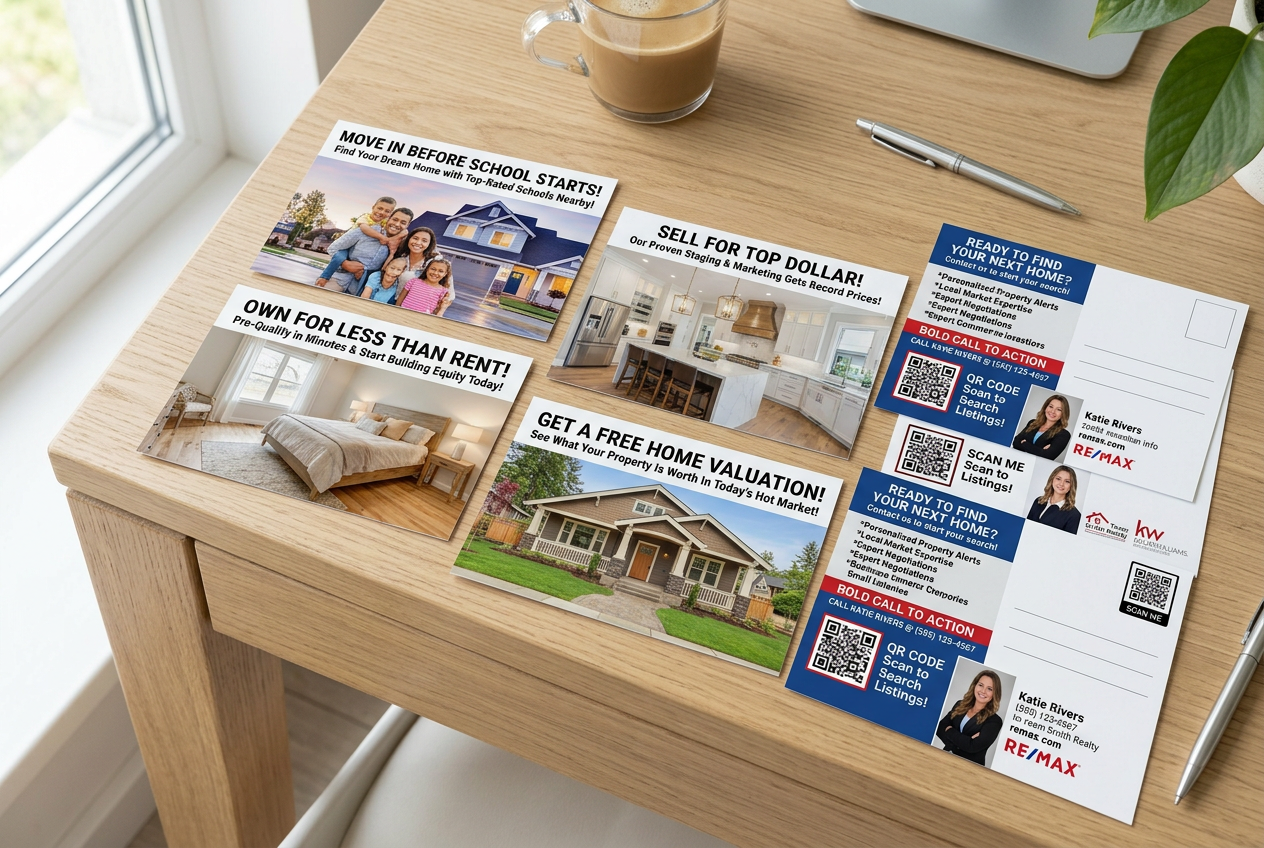
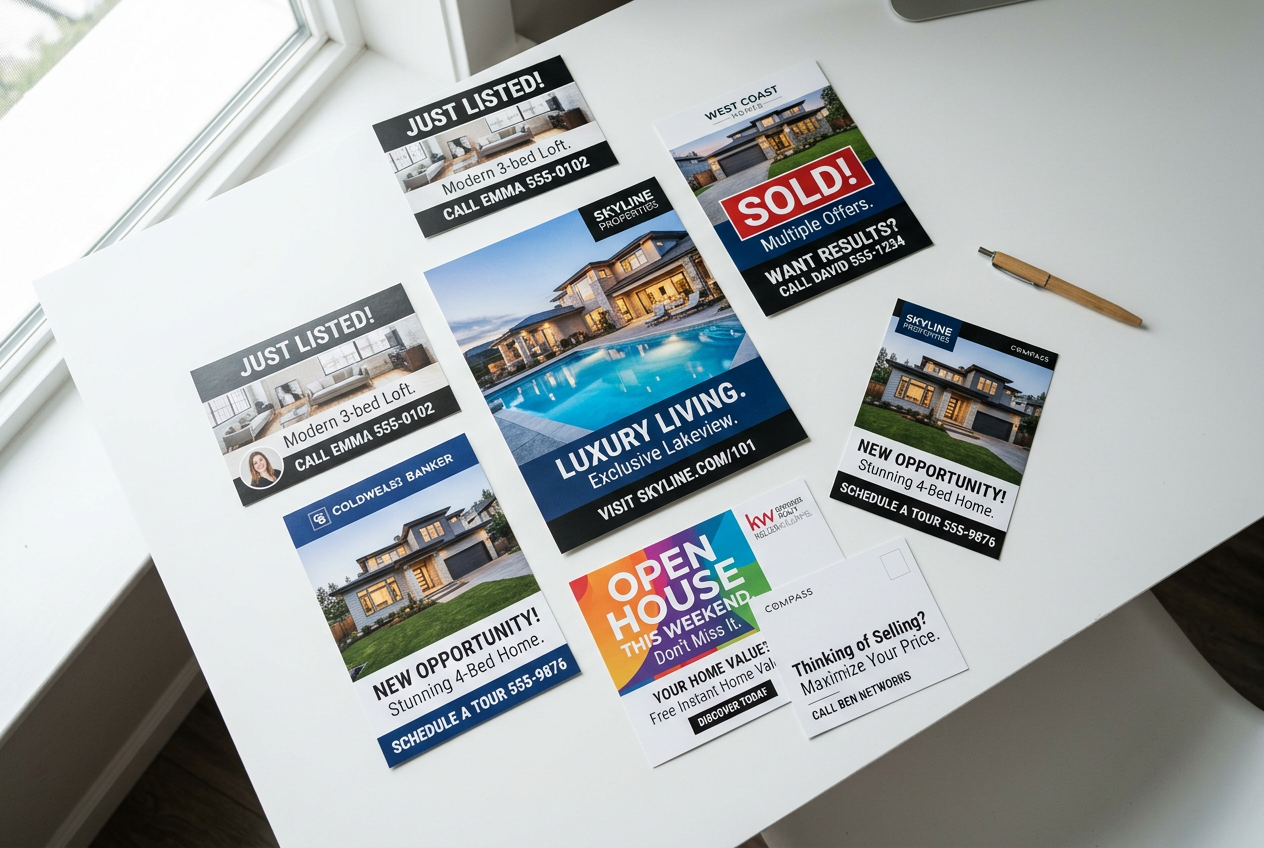
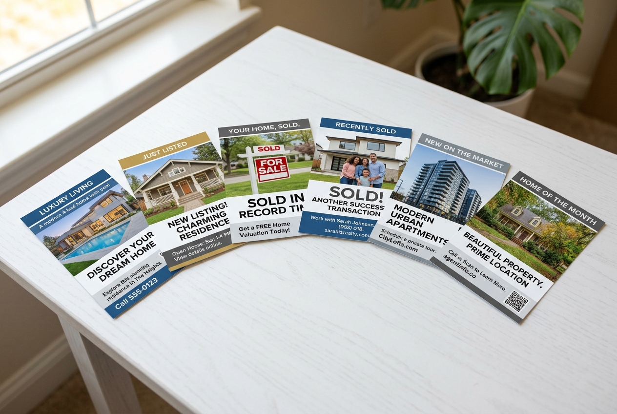
Most postcards need only two design zones: a clean front that stops the sort, and a back that converts the attention into an action. The templates below assume a front hero photo with a short headline, then a back with scan-friendly copy.
Just listed and just sold campaigns work best when the copy talks to neighbors, not buyers. For deeper strategy, see Just Listed and Just Sold postcards. Swipe-ready copy:
- Just sold seller lead: “Another home sold in [neighborhood]. Curious what buyers would pay for [street or subdivision]?” Proof line: “Local pricing changes week to week.” Offer: “Free pricing snapshot for this block.” CTA: “Scan to get the report.”
- Just listed awareness: “New listing near [landmark].” Proof line: “Open for qualified buyers this weekend.” Offer: “Private tour times available.” CTA: “Text ‘TOUR’ for the schedule.”
Open house cards win when they feel like an invitation, not an ad. Pair one photo with the address and a reason to attend. Related tactics live in open house ideas. Swipe-ready copy:
- Open house invite: “Tour the best value in [neighborhood].” Proof line: “Updated kitchen, fenced yard, and easy commute.” Offer: “Snacks and a quick neighborhood market update.” CTA: “Bring this card for directions and parking tips.”
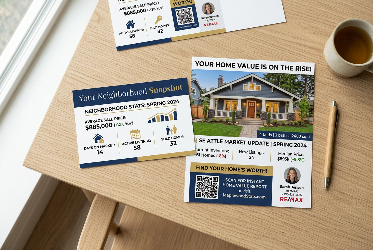
Farming and market-update postcards convert best when they offer a specific takeaway. Swipe-ready copy:
- Market update: “What changed in [neighborhood] this month?” Proof line: “Inventory and pricing shifted.” Offer: “One-page market snapshot for homeowners.” CTA: “Scan to view the report.”
Postcard Size Guide for Direct Mail and EDDM
Size sets the rules for design. Small formats force ruthless simplicity. Larger formats create room for a better photo, a clearer value story, and a scannable back panel.
A small card works for quick announcements that do not need explanation, like a just sold notification. A mid-size card adds space for a short proof line and a more readable CTA. Larger formats make sense for market updates and farming because they can carry a headline, a strong photo, and a clean “why this matters” block.
| Size | Best for | Relative cost | EDDM friendly |
|---|---|---|---|
| 4×6 | quick announcements and simple invites | lowest | sometimes |
| 5×7 | brand-forward cards with a clearer CTA | low | sometimes |
| 6×9 | farming, market updates, and valuation offers | mid | often |
| 6×11 | luxury positioning and high-impact farming | highest | often |
EDDM real estate postcards can reduce list work because the carrier route acts as the “target.” That trade-off also reduces precision. Targeted mail lists usually outperform broad routes when the offer depends on homeowner equity, tenure, or property type.
Teams can also match size to brand. A premium look matters most for luxury, relocation, and high-trust neighborhoods. A lean 4×6 can still work in price-sensitive areas when the offer stays direct.
Real Estate Postcard Copywriting That Gets Responses
Good real estate postcard copywriting reads like a short script, not a brochure. The goal is a single next step that feels easy. Long paragraphs, industry jargon, and multiple requests lower response.
A reliable formula uses four blocks that fit almost any campaign type:
- Headline: lead with a homeowner benefit or a local change. Example: “Homes in [neighborhood] are moving fast.”
- Proof line: add one credibility signal without turning it into a resume. Example: “Recent sales shifted pricing on this street.”
- Single offer: give one reason to respond. Example: “Free home value range and a simple net sheet.”
- One CTA: pick one action channel. Example: “Scan the code to request the report.”
Agents also need a clear rule for what goes on the card versus what stays for the conversation. The postcard should carry the offer, the proof line, and the CTA. The pricing narrative, objections, and detailed CMA belong in the call, the follow-up email, or the listing appointment.
Commission or fee figures rarely belong on postcards. They distract from the offer and can trigger unnecessary comparison shopping. A better use of space is a service promise that supports the offer, then a single conversion path. Postcards still play a role inside broader real estate lead generation systems when the follow-up stays fast and consistent.
Design and Visuals That Earn a Second Look
Most postcards lose in the first second because the image looks like a screenshot. Dark interiors, crooked vertical lines, and cluttered counters signal “low effort,” even when the agent work is excellent.
A clean layout solves most of that. Use one hero image, one strong headline, and two supporting text blocks on the back. Keep fonts simple and limit the palette to brand colors plus a high-contrast CTA button or QR code block. White space does the organizing.
Better visuals lift every postcard type, especially farming and valuation offers. Teams that treat the postcard as a visual channel, not a text channel, usually see better scan rates and more calls. The best starting point is a consistent photo standard tied to visual marketing for real estate across mail, listing pages, and social.
AI-enhanced images can help when the available listing photo looks dated or the room sits vacant. Virtual staging can add furniture to a blank living room, and day-to-dusk edits can replace a flat sky with a more inviting exterior scene. Those edits also require clear Disclosure. Many markets expect labeling aligned with MLS Rules, and teams often add a Virtually Staged Watermark or plain text such as “Virtually staged” on any image that changes furnishings. Market rules vary, so agents should check local MLS Rules before mailing.
A simple “before and after” approach helps design decisions. Before: a dim, empty room with no focal point and no sense of scale. After: the same room virtually staged with a sofa, rug, and lighting that guides the eye toward the windows. The point is not fantasy. The point is clarity.
Mailing Cadence, Lists, and Tracking That Make Postcards Pay Off
A strong template still needs repetition. One mailing often creates awareness but not action. A repeating cadence builds familiarity and makes the next call feel safer.
A practical farming plan starts with a defined area, then a consistent sequence. Many teams pair broad awareness pieces with response-driven offers. Examples include a quarterly market update, a seasonal valuation offer, and a few listing-result cards.
List strategy changes the copy. Route-based mail works for broad awareness and “top of mind” farming. Targeted lists work better for offers that depend on equity, tenure, or property type. Segments worth testing include long-term owners, likely downsizers, and neighborhoods with high turnover.
Printing and mailing logistics also shape the calendar. Standard print runs often take 3 to 7 business days from approval to ship, then additional time in the mail stream. Event-driven cards work best when they land several days before the open house or neighborhood event, not the day of.
Standard approaches also need exceptions. Rural routes can have inconsistent delivery patterns, so teams may rely more on targeted lists and follow-up calls. Condo buildings may restrict mail access, so door-hangers or digital touches may fill gaps. Distressed sales messaging often needs a softer tone and a help-first offer instead of a valuation hook.
Frequently Asked Questions
Do real estate postcards still work in 2026?
Yes, postcards can still generate leads when agents treat them like direct response ads. The strongest results usually come from consistent mailing to the same area, a single offer, and fast follow-up after a scan or call. One-off “brand only” cards often create awareness, but they rarely create enough action to measure.
What should go on the front of a real estate postcard?
A single hero image and one short headline typically work best. The photo sets trust and stops the sort. The headline should speak to the recipient, not the agent, such as a neighborhood update or a clear homeowner benefit. Contact details can stay small, with the primary conversion handled on the back.
What is the best CTA for realtor postcards?
A single CTA that matches the offer tends to outperform multiple asks. For seller-focused cards, a QR code to a home value request form or a short “market snapshot” request works well. For open house cards, the CTA can be the address and time plus one simple way to request directions.
Can virtually staged photos be used on real estate postcards?
Often yes, but Disclosure matters. Many markets expect clear labeling when furniture or decor changes, even if the underlying room stays the same. A simple “Virtually staged” note on the image or a Virtually Staged Watermark can reduce confusion. MLS Rules and advertising rules vary, so agents should verify local requirements.
How can agents track postcard results without special software?
Basic tracking can still work. Agents can use a dedicated QR code that leads to one landing page for that campaign, then compare scans and form fills to the mail drop date. A dedicated phone number also helps separate postcard calls from other channels. The key is using one CTA per card.